By Vivian
/February 11, 2022
Ok so you want to build a table with HTML and you want to style it with Tailwind CSS. But when you create your markup you realize tables look like this:

Like other HTML elements, tables are completely unstyled in Tailwind CSS, its up to you how you want to style it and that can be pretty powerful!
But before I show you how we code our tables, let me first break down something you need to understand when working with Tailwind CSS and tables.
table-auto vs table-fixedTailwind has very little classes that pertain to tables, but there are 2 big ones:
table-auto which allow the table to automatically size columns to fit the contents of the celltable-fixed which allows the table to ignore the content and use fixed widths for columns. The width of the first row will set the column widths for the whole table.Whichever you choose to use, you should put it as a class, directly on the <table> element, that will make the whole table behave accordingly.
Ok so now we got some theory out of the way, let us create our first table and add some styles to it. We’re gonna be using the markup used in the Tailwind docs, here’s our initial markup:
<div class="p-8">
  <table class="table-auto">
    <thead>
      <tr>
        <th>Song</th>
        <th>Artist</th>
        <th>Year</th>
      </tr>
    </thead>
    <tbody>
      <tr>
        <td>The Sliding Mr. Bones (Next Stop, Pottersville)</td>
        <td>Malcolm Lockyer</td>
        <td>1961</td>
      </tr>
      <tr>
        <td>Witchy Woman</td>
        <td>The Eagles</td>
        <td>1972</td>
      </tr>
      <tr>
        <td>Shining Star</td>
        <td>Earth, Wind, and Fire</td>
        <td>1975</td>
      </tr>
    </tbody>
  </table>
</div>
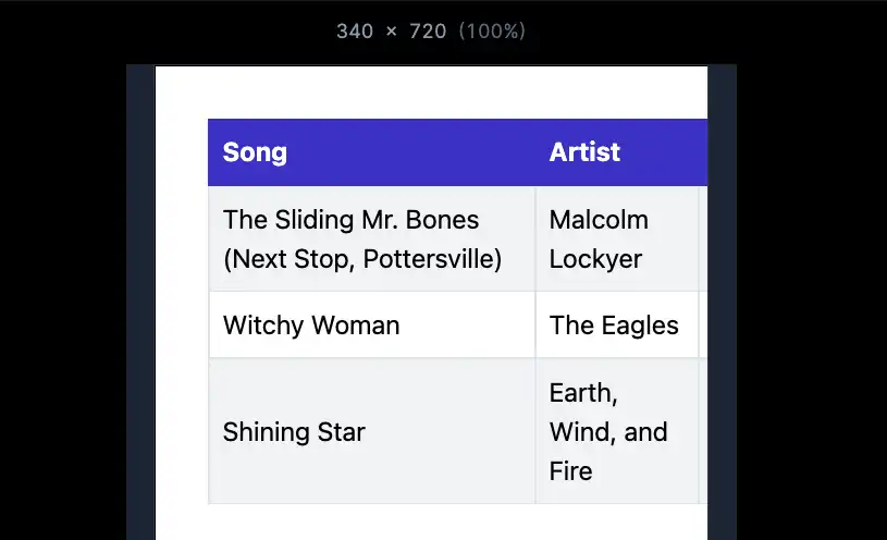
This is the markup used to generate the screenshot you saw at the beginning of the video, and you can also check it out on Tailwind Play here.
Now let’s make it more visually appealing by adding more spacing, an outer border, and text classes.

Looks a bit better, right? Here’s the play link.
And here’s the actual code:
<div class="p-8">
  <table class="table-auto border">
    <thead>
      <tr>
        <th class="font-bold p-2 border-b text-left">Song</th>
        <th class="font-bold p-2 border-b text-left">Artist</th>
        <th class="font-bold py-2 px-4 border-b text-left">Year</th>
      </tr>
    </thead>
    <tbody>
      <tr>
        <td class="p-2 border-b text-left">The Sliding Mr. Bones (Next Stop, Pottersville)</td>
        <td class="p-2 border-b text-left">Malcolm Lockyer</td>
        <td class="py-2 px-4 border-b text-left">1961</td>
      </tr>
      <tr>
        <td class="p-2 border-b text-left">Witchy Woman</td>
        <td class="p-2 border-b text-left">The Eagles</td>
        <td class="py-2 px-4 border-b text-left">1972</td>
      </tr>
      <tr>
        <td class="p-2 border-b text-left">Shining Star</td>
        <td class="p-2 border-b text-left">Earth, Wind, and Fire</td>
        <td class="py-2 px-4 border-b text-left">1975</td>
      </tr>
    </tbody>
  </table>
</div>
As you can see, the big trick is that, for tables in Tailwind CSS, you can treat any table-specific element as any other, so you can style it however you want.
Here are some more examples of common table designs you would encounter, we’re gonna be using the code above as a starter point but with some changes.

This is very easy, just add odd:bg-gray-100 to all your tr elements inside the body. Like this:
<tbody>
  <tr class="odd:bg-gray-100">
    <td class="p-2 border-b text-left">The Sliding Mr. Bones (Next Stop, Pottersville)</td>
  </tr>
For this one you need to add a border to each <td> and **<th>**elements, I just add border-l and that does the trick.
<!--- THs --->
<th class="font-bold py-2 px-4 border-b border-l text-left">Artist</th>

<!--- TDs --->
<td class="p-2 border-b border-l text-left">Malcolm Lockyer</td>
Similar as the striped rows example, we need to add our hover classes to the **<tr>**element, like this:
<tr class="hover:bg-stone-100">
The trick to this one is to add it to the <th> instead of the <tr> inside the <head>, that way you have more control over the text color:
<th class="font-bold p-2 border-b text-left bg-indigo-700 text-white">Song</th>
Here’s the code for everything put together:
<div class="p-8">
  <table class="table-auto border-x border-b">
    <thead>
      <tr>
        <th class="font-bold p-2 border-b border-l border-indigo-700 text-left bg-indigo-700 text-white">Song</th>
        <th class="font-bold p-2 border-b border-l text-left border-indigo-700 bg-indigo-700 text-white">Artist</th>
        <th class="font-bold py-2 px-4 border-b border-l text-left border-indigo-700 bg-indigo-700 text-white">Year</th>
      </tr>
    </thead>
    <tbody>
      <tr class="odd:bg-gray-100 hover:!bg-stone-200">
        <td class="p-2 border-b border-l text-left">The Sliding Mr. Bones (Next Stop, Pottersville)</td>
        <td class="p-2 border-b border-l text-left">Malcolm Lockyer</td>
        <td class="py-2 px-4 border-b border-l text-left">1961</td>
      </tr>
      <tr class="odd:bg-gray-100 hover:!bg-stone-200">
        <td class="p-2 border-b border-l text-left">Witchy Woman</td>
        <td class="p-2 border-b border-l text-left">The Eagles</td>
        <td class="py-2 px-4 border-b border-l text-left">1972</td>
      </tr>
      <tr class="odd:bg-gray-100 hover:!bg-stone-200">
        <td class="p-2 border-b border-l text-left">Shining Star</td>
        <td class="p-2 border-b border-l text-left">Earth, Wind, and Fire</td>
        <td class="py-2 px-4 border-b border-l text-left">1975</td>
      </tr>
    </tbody>
  </table>
</div>There’s been a lot of debate over the years about how to make tables properly responsive. The short answer is that there’s no ideal solution, and anything you decide will have tradeoffs. Nevertheless, I do have two suggestions you can try for making your table content more responsive.

The easiest way to make a table responsive is to make it overflow its parent container.
Here’s how you do that in Tailwind with the code we’re been using:
<div class="p-8 overflow-auto relative">
  <table class="table-fixed border-x border-b w-full">
    <thead>
      <tr>
        <th class="font-bold w-[200px] p-2 border-b border-l border-indigo-700 text-left bg-indigo-700 text-white">Song</th>
        <th class="font-bold w-[100px] p-2 border-b border-l text-left border-indigo-700 bg-indigo-700 text-white">Artist</th>
        <th class="font-bold w-[80px] py-2 px-4 border-b border-l text-left border-indigo-700 bg-indigo-700 text-white">Year</th>
      </tr>
    </thead>
...overflow-auto relative to the parent to activate the overflowtable-fixed instead of table-auto, this is where this class really shines!If you don’t want to hide your table’s information on mobile then I seriously recommend you change the layout of your data. A very common example is to change from a table to a card or a similar layout.
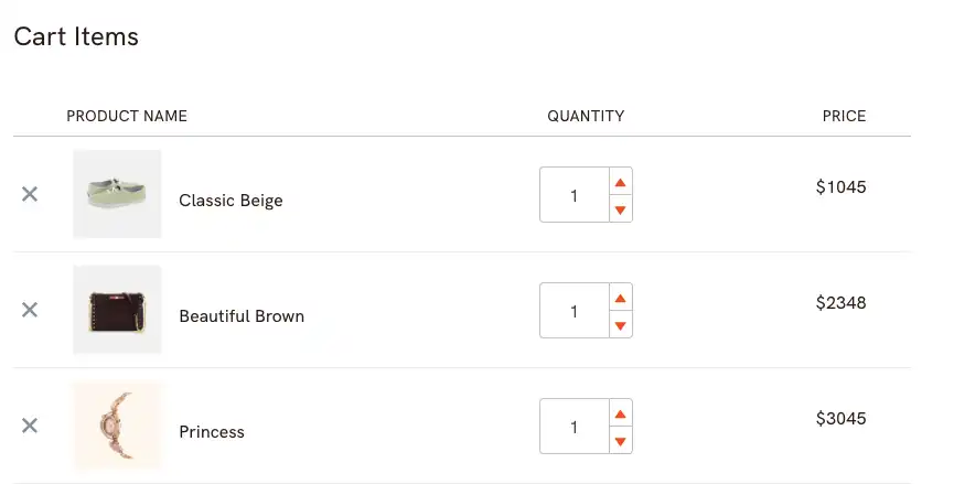
This is exactly what we’re doing on our e-commerce template, Elyssi, check out the demo here. If you resize your browser or check the demo on mobile you’ll see that we switched from this:

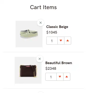
To this:

Which makes it way more easier to use for users on mobile.
Of course, you’ll have to ask your designer for an alternative layout or if you’re designing on your own you may have to find different examples for inspiration to better accommodate your data but I think it will be worth it in the long run.