By Vivian
/March 12, 2022
One thing that Tailwind CSS lacked in the early days was support for styling user-generated content, due to the nature of the framework, it was kind of complicated and you ended up with a lot of custom CSS to achieve consistency over a styleguide.
After the release of v2, we got introduced to the first iteration of the typography plugin, and while it was a tremendous help it did lack a few important features like disabling the styling for some nested elements. It also forced you to do all your styling inside the Tailwind config file, basically writing all your CSS inside Javascript and that wasn’t always the best developer experience.
Well, the good news is that with v3, we got a completely revamped experience! The Tailwind Labs team addressed the most common concerns and introduced the ability to write all your style directly inside the parent element, which is soo cool.
Now, while the docs are an excellent way to learn about the plugin, over my time using it I have discovered a few gotchas and some best practices on how to work with it. My plan with this piece is to walk you through styling some HTML with it and show you some improvements you can make to your code to make the most of it.
Let’s get to it!
For those of you who want to skip ahead and see the finished code, here’s the finished demo.
For those of you who just want to see the HTML we’ll be working with, here’s a link with it.
As you can see, it’s pretty standard and has most of the commonly used HTML elements you’ll encounter while doing web development.
I added some styling to the first parent element to make it look better on the demo.
The first thing we need to do to use the plugin is to add the prose class to the direct parent of the HTML you’ll be styling. So we would do:
<div class="p-8 border my-10 mx-auto shadow-md max-w-2xl bg-white rounded-lg">
  <div class="prose"> <!-- Direct parent element -->
    <h1>
      This is the primary heading and there should only be one of
      <strong>these</strong> per page
    </h1>
		<!-- More HTML code -->
One thing devs find out soon enough when using the plugin is that it comes with a fixed max-width, the logic behind it was that each line should not be wider than 65ch, or 65 characters, to make it more readable to the user. If you want to disable that, just add max-w-none to the parent element.
<div class="max-w-none prose"> <!-- Direct parent element -->Adding the prose class gives you A LOT of default style out of the box and while the defaults look pretty good, we can still customize it to whatever we want.
We’ll start by making the headings use a serif font and changing the colors, luckily for us, the plugin has a built in class called prose-headings that targets headers h1-h4 and th so that’s what we’ll be using.
<!-- Direct parent element -->
<div class="max-w-none prose prose-headings:font-serif prose-headings:text-emerald-700">
h5 and h6?The plugin doesn’t provide styles for these but the plugin’s CSS is extensible so we can add the styles ourselves to the Tailwind config, like this:
// Inside the Tailwind Config file
module.exports = {
  theme: {
    extend: {
      typography: (theme) => ({
        DEFAULT: {
          css: {
            'h5, h6': {
              color: theme('colors.emerald.700'),
              fontWeight: 'bold',
              fontFamily: theme('fontFamily.serif')
            },
          },
        },
      }),
    },
  },
Next, let’s style general content. One quirk of the plugin is that there are different color variables for strong, p and em tags, which means if you change the colors of your p elements, you’ll also have to change it for the other tags to keep it consistent. Otherwise, if you like, for example, make your p tags green, your strong and em tags, will appear gray (since this is the default color).
With this said, we’ll style our tags a dark grey.
<!-- Direct parent element -->
<div class="max-w-none prose prose-strong:text-gray-600 prose-em:text-gray-600 prose-p:text-gray-600">
a tags are usually styled differently than your other tags to make them stand out and also have hover states, we’ll do the same for ours:
<!-- Direct parent element -->
<div class="max-w-none prose prose-a:text-emerald-700 hover:prose-a:text-emerald-900">For lists, we have both ul and ol to account for, and both of them use li. For the ul and old, I like to use list-inside or list-outside depending on the design, for this demo I used the former.
For li we have to set the color (which would be the same as the p, to maintain consistency) but we can also set the color of the bullets (for **ul**s) and the numbers (for **ol**s). To achieve this, we can use the :marker pseudo class, the ending result would be prose-li:marker:text-emerald-700.
<!-- Direct parent element -->
<div class="max-w-none prose prose-li:text-gray-600 prose-ul:list-inside prose-ol:list-inside prose-li:marker:text-emerald-700">

Images can be kind of tricky to style, depending on the structure we have. Sometimes we have a single img, sometimes the img is inside a parent element, sometimes we have a picture element. The official plugin demo has a few examples of this.
But for this demo we’ll stick to the simple img and add simple styling, just a border and some padding.
<!-- Direct parent element -->
<div class="max-w-none prose prose-img:w-full prose-img:border prose-img:p-1">
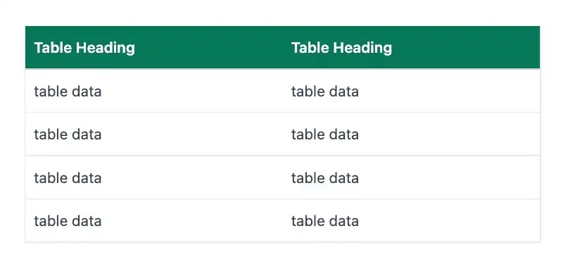
Tables are the bane of many developers’ existence, especially because of its rigid structure and the challenges of making them responsive.
But fear not, the plugin gives us a lot of flexibility when styling table inside your content. we have table, tr, th and td available for us to style; for our demo we’re adding a background color to **th**s, a border to table and some padding to **th**s and td to make the content more readable.
<!-- Direct parent element -->
<div class="max-w-none prose prose-th:bg-emerald-700 prose-th:text-white prose-th:font-sans prose-th:p-2 prose-table:border prose-td:p-2">
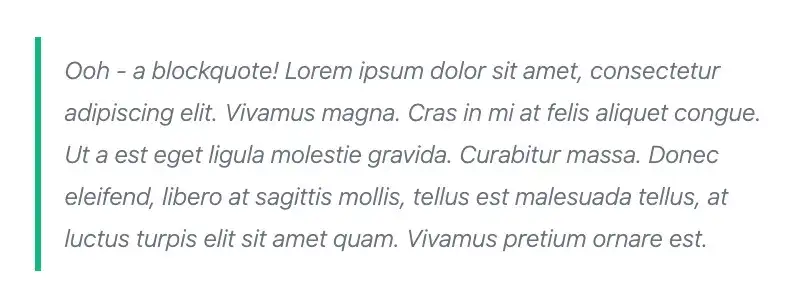
Blockquotes are notoriously ignored sometimes but they’re very useful for content with quotes we want to highlight. For our demo we’re adding some padding, our chosen colors and make the font weight lighter than the body text to make it stand out.
<!-- Direct parent element -->
<div class="max-w-none prose prose-blockquote:text-gray-500 prose-blockquote:border-emerald-500 prose-blockquote:font-light">
If you combine all of the above you get this:
<!-- Direct parent element -->
<div class="max-w-none prose prose-headings:font-serif prose-headings:text-emerald-700 prose-strong:text-gray-600 prose-em:text-gray-600 prose-p:text-gray-600 prose-a:text-emerald-700 hover:prose-a:text-emerald-900 prose-li:text-gray-600 prose-ul:list-inside prose-ol:list-inside prose-li:marker:text-emerald-700 prose-img:w-full prose-img:border prose-img:p-1 prose-th:bg-emerald-700 prose-th:text-white prose-th:font-sans prose-th:p-2 prose-table:border prose-td:p-2 prose-blockquote:pl-4 prose-blockquote:py-2 prose-blockquote:text-gray-500 prose-blockquote:border-emerald-500 prose-blockquote:font-light">
Quite a handful of classes, right? I know it can get overwhelming and we haven’t even scratched the surface of the type of customizations we could do but I think this is a good starting point.
If you do find that you cannot stand that huge block of text as your classes then feel free to add it as custom CSS and use the @apply directive.
You could do something like:
.prose-custom {
	@apply max-w-none prose prose-headings:font-serif prose-headings:text-emerald-700 prose-strong:text-gray-600 prose-em:text-gray-600 prose-p:text-gray-600 prose-a:text-emerald-700 hover:prose-a:text-emerald-900 prose-li:text-gray-600 prose-ul:list-inside prose-ol:list-inside prose-li:marker:text-emerald-700 prose-img:w-full prose-img:border prose-img:p-1 prose-th:bg-emerald-700 prose-th:text-white prose-th:font-sans prose-th:p-2 prose-table:border prose-td:p-2 prose-blockquote:pl-4 prose-blockquote:py-2 prose-blockquote:text-gray-500 prose-blockquote:border-emerald-500 prose-blockquote:font-light;
}
And just reuse the class prose-custom whenever you have any user-generated content.
That’s it for this tutorial, I hope you learned a bit more about the official Typography plugin and feel more comfortable using it. And I definitely encourage you to read the docs, they’re great to better understand all the capabilities of the plugin and you’ll also see that there are even more elements to style than what we covered in this article.
Until the next one!